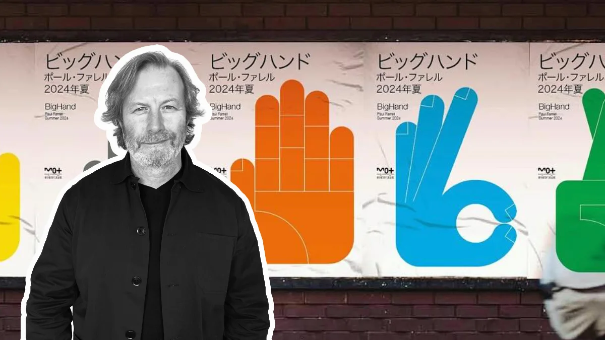
The Art of Simplicity: Inside Paul Farrell's Big Hands Series
by Electric Gallery
Thursday 2 July 2026
The Art of Simplicity: Inside Paul Farrell's Big Hands Series
When an artwork is stripped back to its simplest form, every line, shape and colour has to earn its place.
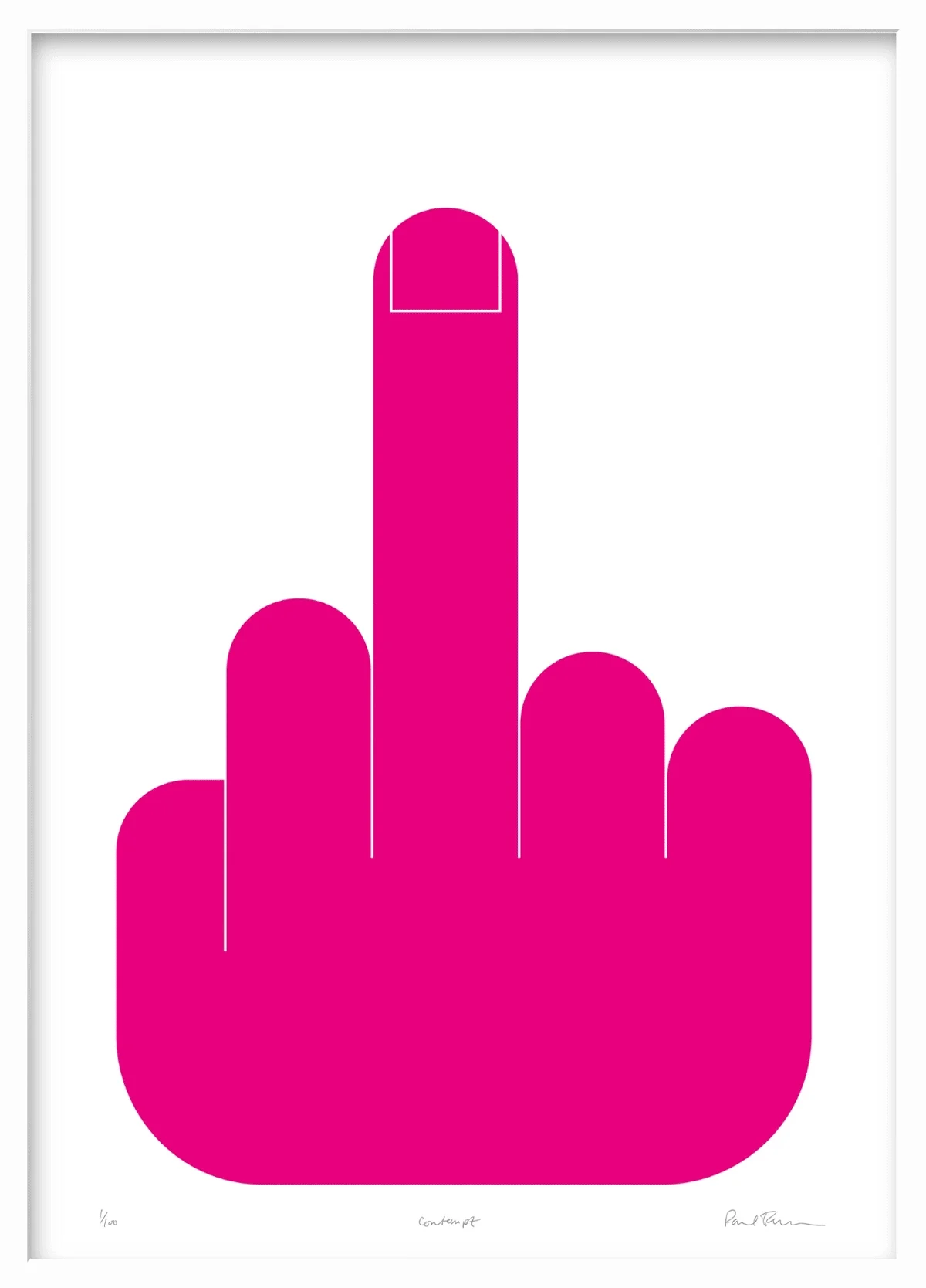
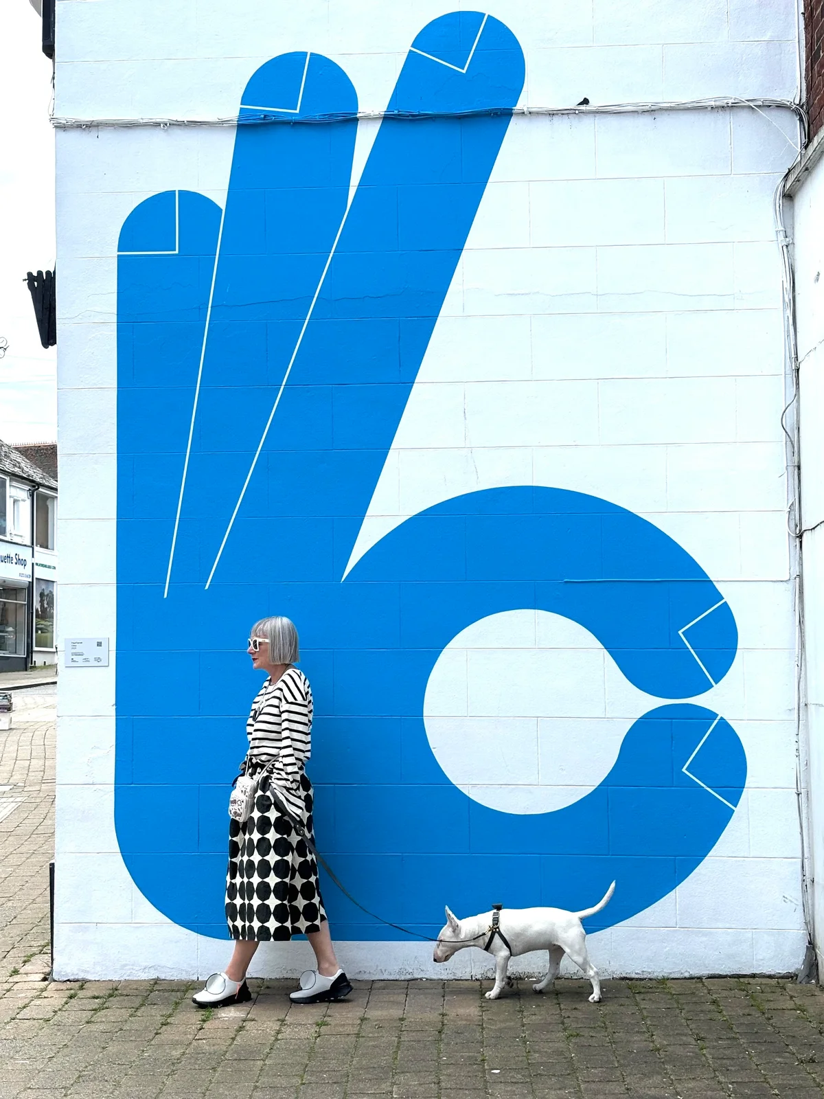
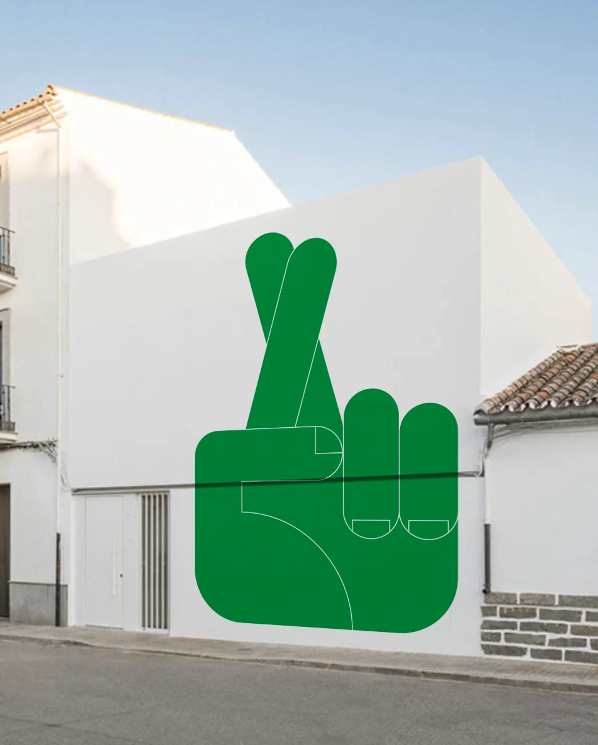
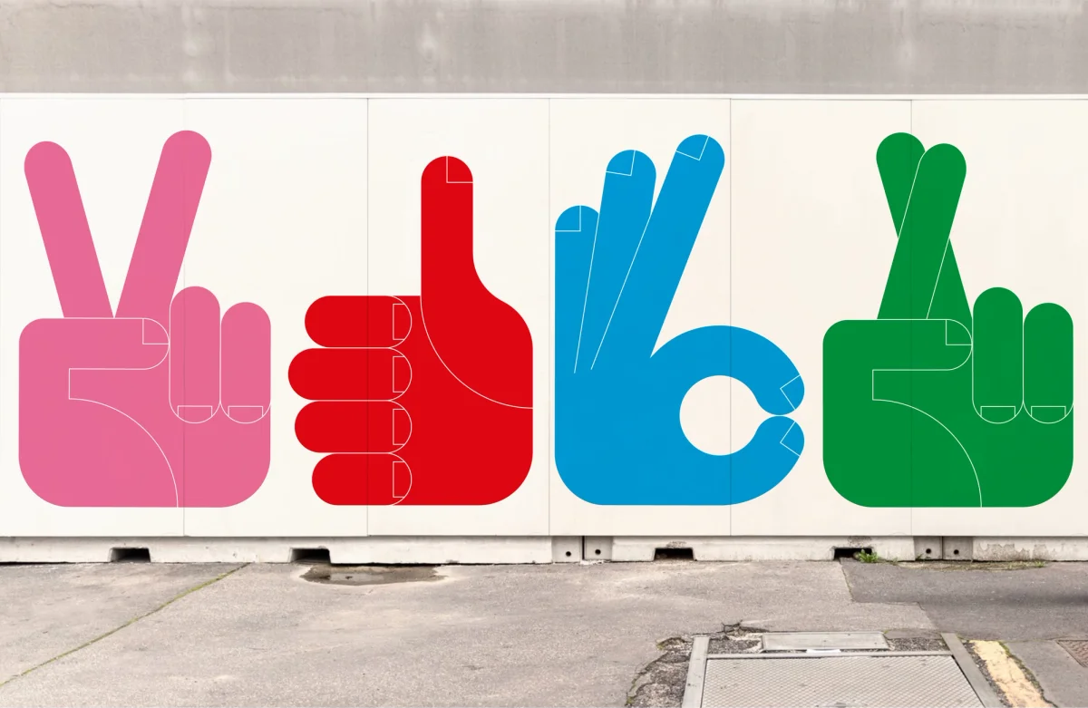
That's the thinking behind Paul Farrell's Big Hands series, a collection of bold, graphic prints that transform one of the most familiar parts of the human body into striking contemporary artworks. Instantly recognisable yet carefully refined, each print demonstrates how simplicity can often communicate more powerfully than complexity.
Since introducing the collection to Electric Gallery earlier this year, Big Hands has become one of our most popular contemporary print series. Their universal appeal, vibrant colour palettes and confident compositions have resonated with collectors looking for artwork that is both playful and visually impactful.
We recently spoke with Paul about the ideas behind the collection, the challenge of simplifying a universally recognised form, and why the humble hand continues to inspire his work.
Why Hands?
Hands are one of the oldest forms of communication. Long before written language, gestures allowed us to express emotion, intention and connection. Even today, a thumbs up, clenched fist or simple "OK" sign can be understood almost instantly across much of the world.
For Paul, that universal familiarity became the perfect starting point.
What first led you to focus on hands as the central subject for this series?
"I simply wanted to choose a subject that was familiar and on the whole universal. The fact that hand gestures are used actively on social media as an emoji meant that hopefully the imagery would resonate with people and ideally become an appealing commercial series."
The connection to modern visual culture is particularly interesting. While the hand has been a recurring subject throughout the history of art, today's audiences encounter gestures constantly through emojis, icons and digital communication. Paul's prints bridge those two worlds, taking an everyday visual language and transforming it into bold contemporary art.
Simplicity Is More Difficult Than It Looks
The Big Hands series feels effortless, but achieving that level of simplicity requires remarkable discipline.
Rather than adding detail, Paul focuses on removing it. Every curve, edge and proportion is considered until only the essential elements remain.
Was it a visual decision first, or something more conceptual that came later?
"Visual, yes. It was an immediate sound decision - as I think of work being a collection or a series of many images all quite similar, hand gestures fitted that perfectly. I'd studied the human hand and understood I could treat the surface anatomy as simple sections and then how would these shared sections work across many gestures."
What do you feel you gain by reducing the hand into a bold, simplified graphic shape?
"I gain a strong visual communication. Like with most subjects, if you reduce it to its basic component parts it becomes clear, more recognisable and impactful. A single colour assigned to each design helps support this simplicity."
It's a philosophy that runs throughout Paul's wider practice. Simplicity isn't about taking something away; it's about revealing what matters most.
Nothing Lost, Everything Gained
Many artists worry that reducing detail risks losing character or emotion.
Paul sees it differently.
What gets lost - and does that matter to you?
"Nothing is lost, only gained. Additional detail is not necessary and I can only work in this style - a bold, simple, colourful and graphic representation of the everyday."
That confidence is what gives the series its distinctive identity. Each print is instantly recognisable, yet every unnecessary element has been removed, leaving only strong composition, clean colour and confident design.
Building a Visual Language
Although each print depicts a different gesture, together they feel unmistakably connected.
There's a consistency that runs through the entire collection, almost as though the same hand is performing different movements.
Do you think of these hands as depicting a specific gesture, or as building blocks of a visual language?
"The illustrated gesture does become a single image and more than a familiar gesture. They are also built using a grid and a limited set of regular shapes with regular edges and angles. Following these self-set guidelines means each design is related to the next, almost as it is the same hand making different gestures."
That structured approach gives the series a rhythm. Whether viewed individually or as a gallery wall, each artwork belongs to the same visual family while retaining its own personality.
Balancing Recognition and Graphic Design
One of the biggest challenges in creating graphic artwork is knowing when to stop simplifying.
Push too far and the subject becomes abstract. Leave too much in and the image loses its clarity.
At what point does a gesture stop being "read" and become purely graphic?
"From the start, depending how visually aware you are. The most popular design 'Okay' has equally become an appealing silhouette. I have been mindful not to abstract the design and knew when my representation of each gesture was still legible."
That balance between recognisable gesture and striking graphic composition is what makes the Big Hands series so engaging. Viewers may first respond to the familiar gesture before appreciating the strength of the design itself.
Designing Within Constraints
Creativity often flourishes within limitations.
For Paul, working within a carefully defined set of rules is an essential part of the process.
How do you decide on the exact pose or angle of each hand?
"Because I set myself, and follow, constraints such as a grid, colour palette and regular forms, this process is already dictated... I'm fine with this as it eliminates endless infinite options, which is not the way I work."
Rather than restricting creativity, those constraints create consistency. Every print feels purposeful, refined and unmistakably part of the same collection.
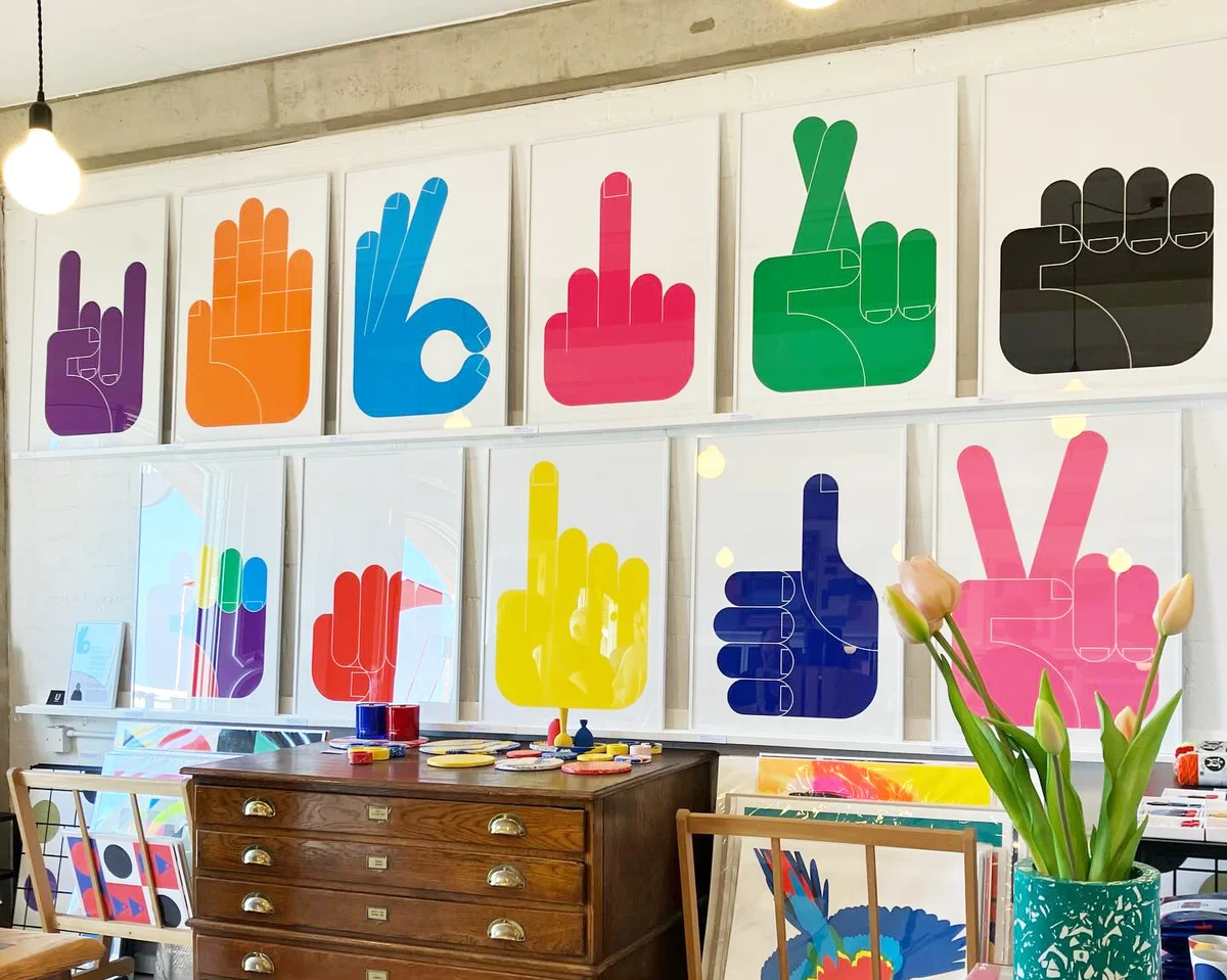
Colour, Contrast and Scale
Bold colour is central to the Big Hands series.
Each print uses large areas of flat colour to reinforce the clarity of the composition, allowing the gesture itself to become the focus.
How important is contrast, flatness and colour choice in shaping how the hand is read?
"All of these key details are important as it's the sum of the parts that is important - even, large areas of bold colour all strengthen the simplicity of the design."
Scale also plays a major role in how the works are experienced.
How does scale affect these works when they are reproduced or displayed large?
"Generally people prefer large scale work. It's more of a statement and adds strength and character. Wall art is naturally more impressive if reproduced at a large size."
It's easy to see why. Enlarged to statement proportions, the bold silhouettes become architectural elements within an interior, commanding attention while remaining visually clean and uncluttered.
Why Big Hands Has Connected With Collectors
The success of the series hasn't happened by accident.
Paul deliberately wanted to create work that was accessible, memorable and instantly understood.
What defines the Big Hands series for you compared to earlier work?
"It enables a more extensive collection of work. The subject has resonated more with people. It is also the simplest and largest representation of a subject. It is the most popular and I'd like to think it embodies what is a successful formula for image making."
His observations mirror what we've seen at Electric Gallery. The collection appeals to both first-time collectors and seasoned buyers, proving that contemporary printmaking doesn't need to be complicated to make a lasting impression.
A Universal Language
At its heart, Big Hands is a celebration of visual communication.
The gestures remain familiar, but through colour, composition and graphic simplification they become something entirely new.
We asked Paul one final question.
What do you think a simple gesture like a hand can communicate when it's stripped down to its most graphic form?
"They still communicate the same... It's a powerful graphic statement and realisation that when stylised and simplified they still mean the same to so many people."
Perhaps that's the lasting appeal of the series. It reminds us that the strongest visual ideas are often the simplest.
Explore Paul Farrell's Big Hands collection at Electric Gallery and discover a series of contemporary graphic prints that celebrate colour, clarity and the universal language of the human hand.